Google Pixel Slate vs. Apple iPad Pro
If you’re looking for a super premium 2-in-1 this holiday season, the iPad Pro, Google Pixel Slate, and Microsoft Surface Pro 6 are the top three ways to go.
All three look pretty similar on the surface, but have different takes on what it means to be a true 2-in-1. With the fresh release of the Google Pixel Slate, we’re diving a bit deeper to compare it to the 12.9-inch iPad Pro.
Design
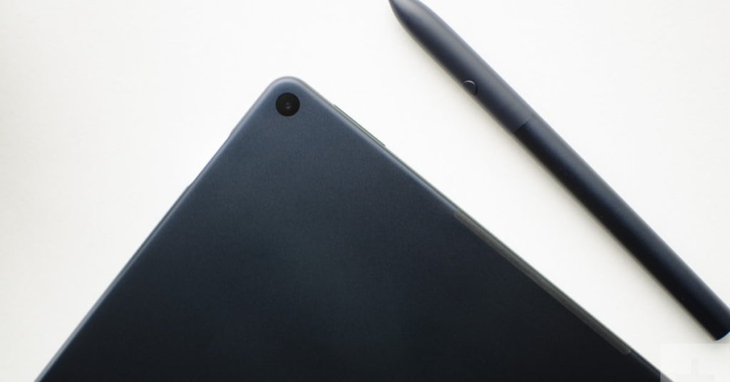
The design of premium tablets is common these days, and both the Pixel Slate and the iPad Pro are initially hard to tell apart. The Google Pixel Slate is thin and light, crafted with rounded corners and comes in at 1.6 pounds, making it slightly heavier than this year’s slimmed down 1.4-pound iPad Pro.
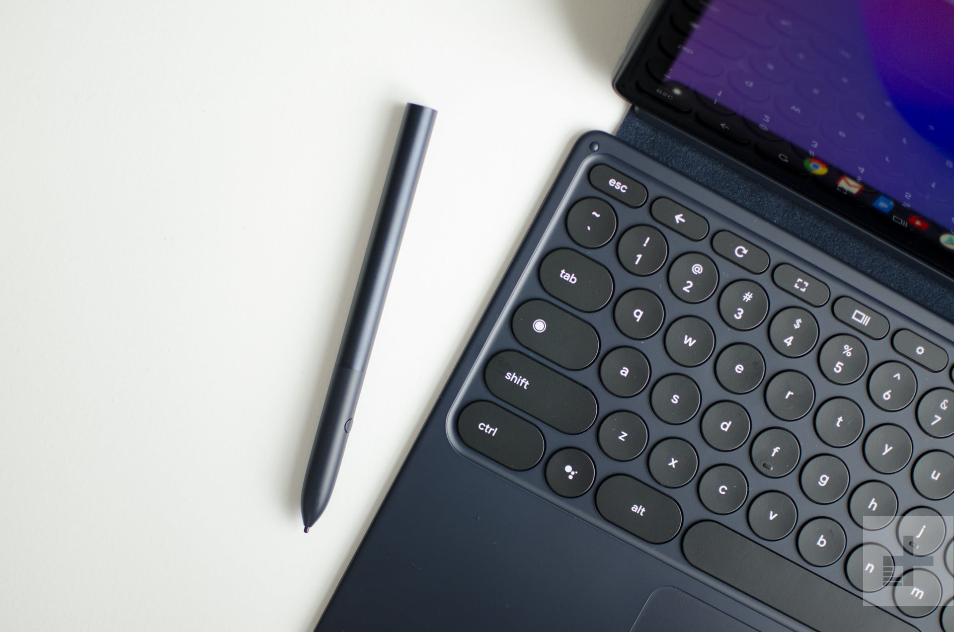
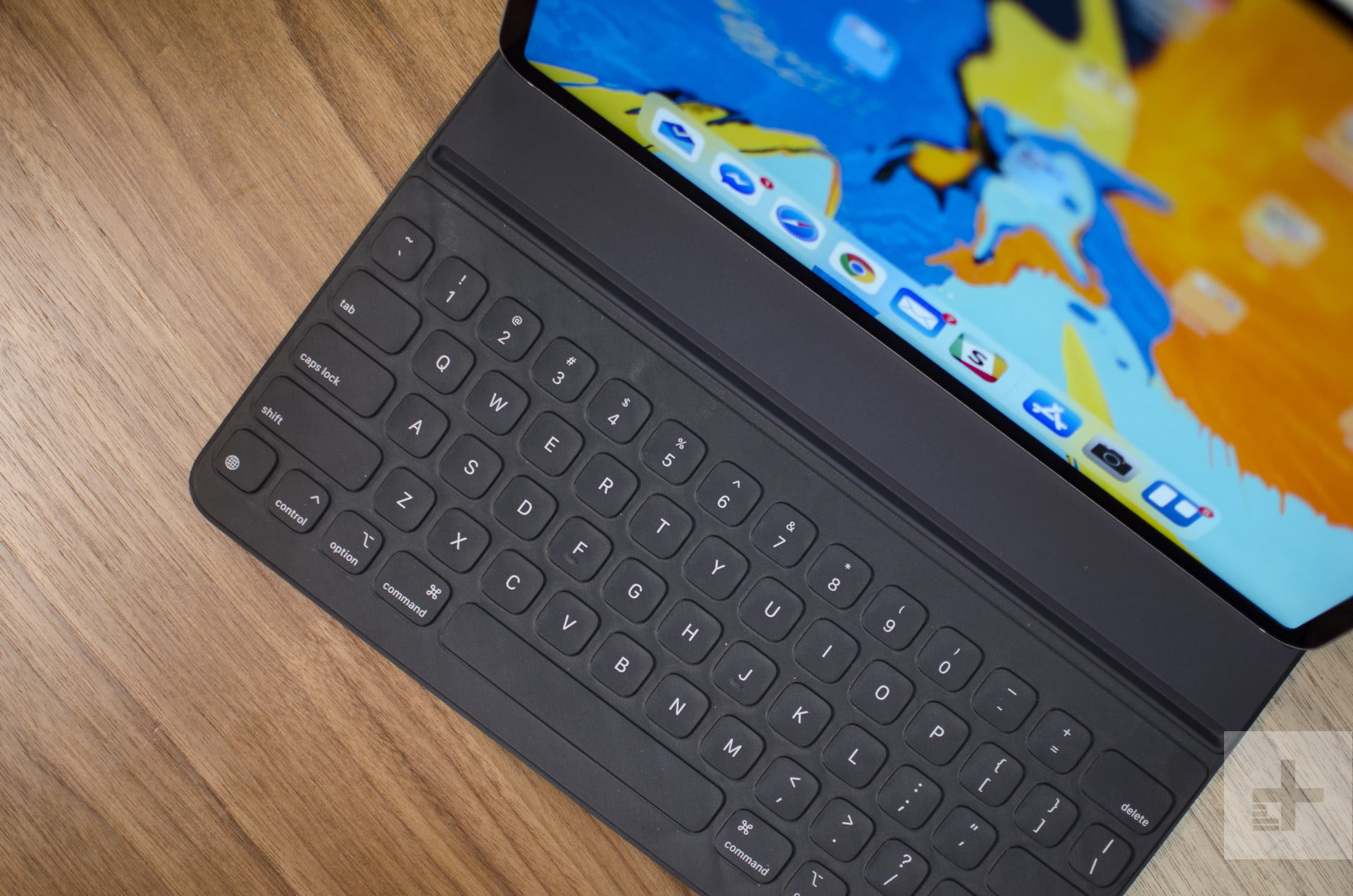
Both devices lack an integrated kickstand and depend on the use of a separately purchased keyboard cover to stay propped up. The keyboard cover on the Pixel Slate is more advanced, allowing the tablet to adjust to different screen angles, and the rounded keys are also backlit, making it easier to type in the dark. Another advantage with the Pixel Slate’s keyboard cover is that it includes a trackpad whereas the iPad Pro requires you to move your hands away from the keyboard to tap on things using the touchscreen. Both keyboards, however, suffer from shallow key travel, so you may experience finger fatigue if you type long documents or emails.
The displays on the two devices are also similar, and both Apple and Google want to make sure you have the best Netflix viewing pleasure. Apple’s 12.9-inch has 2,732 x 2,048 resolution, which works out to 264 pixels per inch across a 12.9-inch screen. The Pixel Slate has 3,000 x 2,000 resolution, which is 293 pixels per inch across a 12.3-inch screen. The Pixel Slate has a sharp display, which we found to be big, bright, and colorful in our review, making it a winner. Google could improve the Pixel Slate next year by making the bezels smaller, similar to what Apple has done on the 2018 iPad Pro.
There’s also a difference in aspect ratio. The iPad has a 4:3 aspect ratio, while the Slate has a 3:2 aspect ratio. In practice, that means the iPad is a little closer to a square and feels more like the size of a piece of paper. The Slate’s aspect ratio is a bit wider, so 16:9 videos will have smaller black bars surrounding them.
Performance
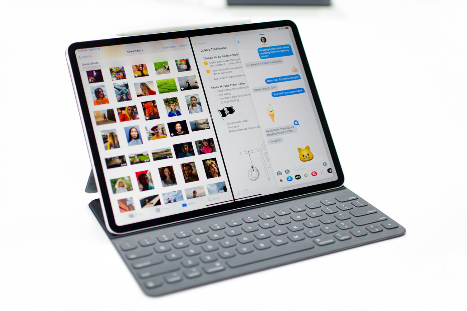
Under the hood, the Google Slate is powered by a touch-centric new version of Chrome OS, whereas the iPad Pro is powered by iOS 12. Both operating systems are mobile-centric, so your choice of the tablet just depends on which platform you prefer. Though iOS has no mouse support (and Chrome OS does) you’ll find similar apps and multi-tasking features across both platforms. Given how mature iOS is on tablets, the iPad Pro delivers a more polished experience. Many of the apps on the Pixel Slate didn’t support Google’s split-screen multitasking feature at this time, and even the swiping gestures didn’t work all the time.
Greater differences can be found in the hardware. For $999, you’re getting a 12.9 inch iPad Pro with 4GB of RAM, 64GB, of storage, an A12X chip with 64‑bit architecture, and embedded M12 co-processor. The Pixel Slate starts at a lower $599, but you’re getting a weaker Intel Celeron Processor, 4GB RAM, and 32GB of storage. The Intel Celeron Processor found on most cheaper Chromebooks feels slow when multitasking and doing more demanding tasks. To match the performance of the iPad, you’ll need to upgrade the Pixel Slate to a more expensive configuration, which tops out with an 8th-Generation Intel Core i7 processor. Even our review unit, which was equipped with an upgraded Core M processor, felt clunky, suffering from performance issues that could be chalked up to early software bugs.
Keep in mind that both devices can be purchased with an optional pen. Apple’s is $99 and so is the one from Google. Considering the specifications, there are not many differences between them both, and both work fine for inking, drawing, and other tasks.
Portability
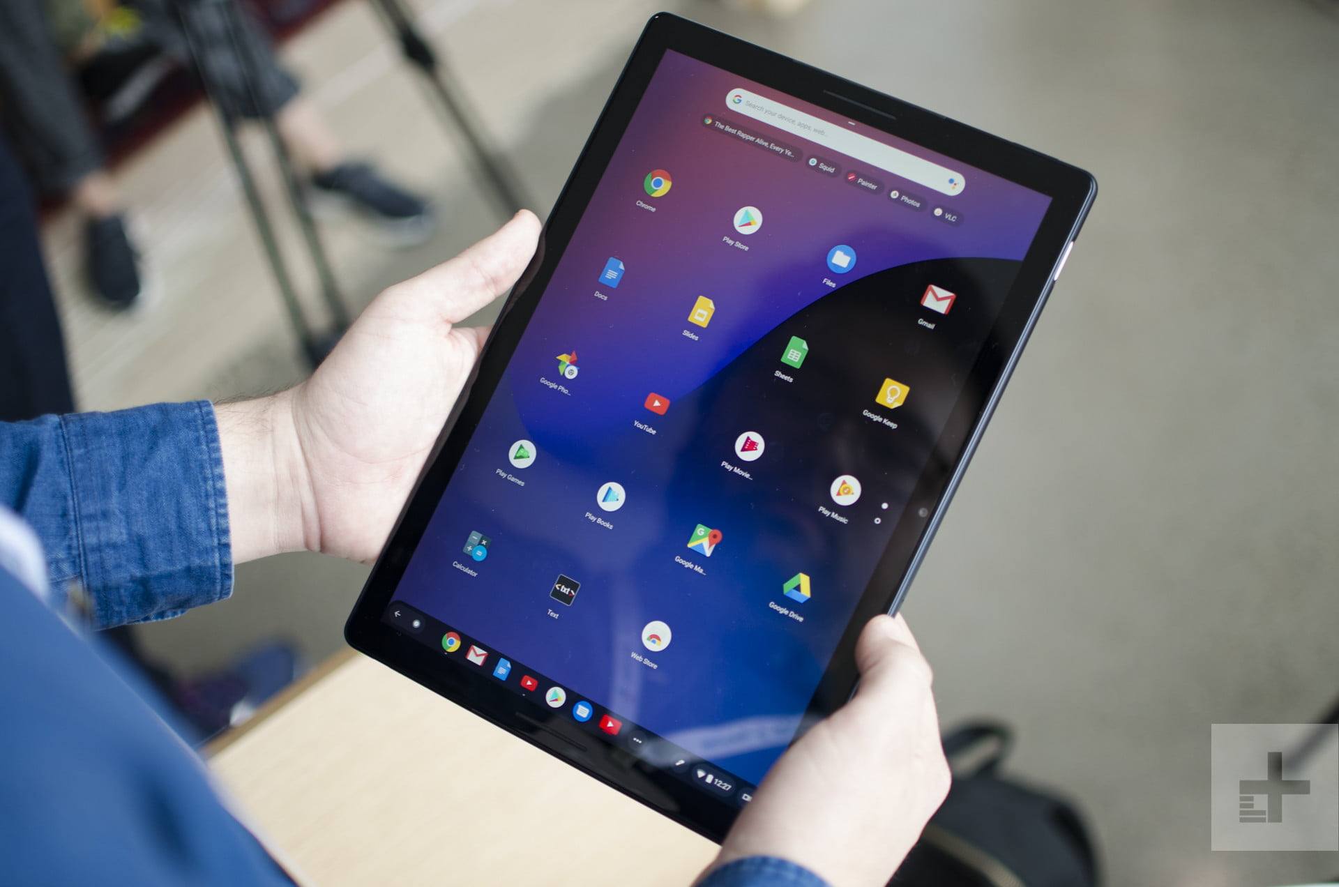
When considering the portability of the Google Pixel Slate and the iPad Pro 12.9 inch, you need to consider their dimensions. The iPad Pro measures 11.04 x 8.46 x 0.23 inches, and the Pixel Slate comes in at 11.45 inches x 7.95 inches x .27 inches. Both are truly light and portable, but we think that the smaller length on the Google Pixel makes it easier to pack away when traveling. The iPad Pro is lighter and thinner, though both are a bit too big to comfortably hold for extended amounts of time.
As for battery life, Google promises that you’ll get up to 12 hours with mixed usage on the Pixel Slate. In our testing, we got up to 10 hours on the iPad, which is still good. iOS is also known for excellent standby time — it uses little battery when not actively used. We don’t yet know how the Slate’s standby time will compare, but Chrome OS devices usually don’t handle standby as well as an iPad.
Coming down to the connectivity while on the go, the Pixel Slate looks to be the winner. Though Apple has replaced the Lightning connector on this year’s iPad Pro with a USB-C connector, the port’s functionality is limited, and you won’t be able to connect devices like external drives or a mouse. The Pixel Slate comes with two USB-C ports for charging, 4K display output, and data transfer. Like the iPad Pro, there’s no headphone jack on the Pixel Slate, but there are killer dual-firing speakers for better surround sound. You’ll need a dongle or Bluetooth headphones with either tablet.
Get the iPad
At the end of the day, if you need a high-end tablet, the iPad Pro is the clear winner, delivering polished performance and ease of use. While Google’s Pixel Slate may be the more capable laptop replacement, the device still suffers from some performance issues and buggy software. It might offer the more complete 2-in-1 experience, the iPad Pro benefits from a robust ecosystem of apps, a solid user experience, and optional integrated LTE for on-the-go connectivity.
